Bleacher Report
AMA TRACK REDESIGN - REVENUE
Client Goal: To update and improve upon the existing in-app 'Ask me Anything' (AMA) feature. Stakeholders requested increased comment discoverability, the ability to see if AMA is live or not, greater athlete/fan personalization, and increased ad opportunities.
Tools Used: Figma, Notion, UserTesting.com, Slack
This user journey maps the current user flow for an B/R in-app AMA experience. Accompanied by screenshots, the map mimics how hidden the feature is within the app, as well as notes every single touchpoint. In the POV of a user, we are given insight into their thoughts of the existing AMA experience, and opportunities to leverage on during this redesign.
Step 2: Comparative Audits
The intended purpose of these comparative audits was to visualize what similar social apps are doing and how it benefits them uniquely.
Instagram/ Instagram Live
-
Truly feels authentic in the way you're connecting with a person [real-time feedback + interaction]
-
Carousel of Content aids in UI and overall discoverability
-
Top Tweets + Latest Tweets tab view: introduces sorting
-
Character limit forces out-of-the-box thinking and originality
-
Ads are seamlessly integrated into the feed, not disruptive to the overall user experience
iMessage
-
typing indicator allows user to be informed of response time
-
(❤️, 👍, 👎, ⁉️) allow users to have the capability to uniquely respond to each individual message
Step 3: Initial Sketches


Track View

Live AMA
These initial sketches were a very rough view of the updated UI for an AMA experiences.
Step 4: Iterations + Wireframes

After receiving feedback from product, programming and engineering - here are two initial wireframes that were created to illustrate the future layout of an AMA. To view the wireframes in a full view, please click here.
Step 5: Prototype + User Feedback
Moving into visual hierarchy, it was time to test the layout of the elements and the overall navigation with sports-app users. Utilizing usertesting.com, this particular prototype was tested with 4 different users with varying knowledge of the B/R app. Users were from diversified backgrounds, but all fell within the target age range. To view the prototype in action, click here.
User feedback was generally positive, as they felt like there was no knowledge gap between UX/UI elements and what they were already familiar with. They appreciated elements of personalization between themselves and the athlete. The main painpoint was that users desired design consistency to what already existed in the current B/R app.
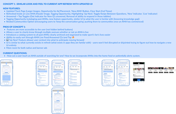
Step 6: Iterations + Final Designs
Visual design was the main focus on this final iteration. Using the existing B/R design system and components, I was able to craft a renovated AMA experience that changes UI based on a pre, live, and post AMA state. That way users are clearly able to distinguish visually the difference between different AMAs and the way they can interact with each screen. Please click here to view the final designs in action.